


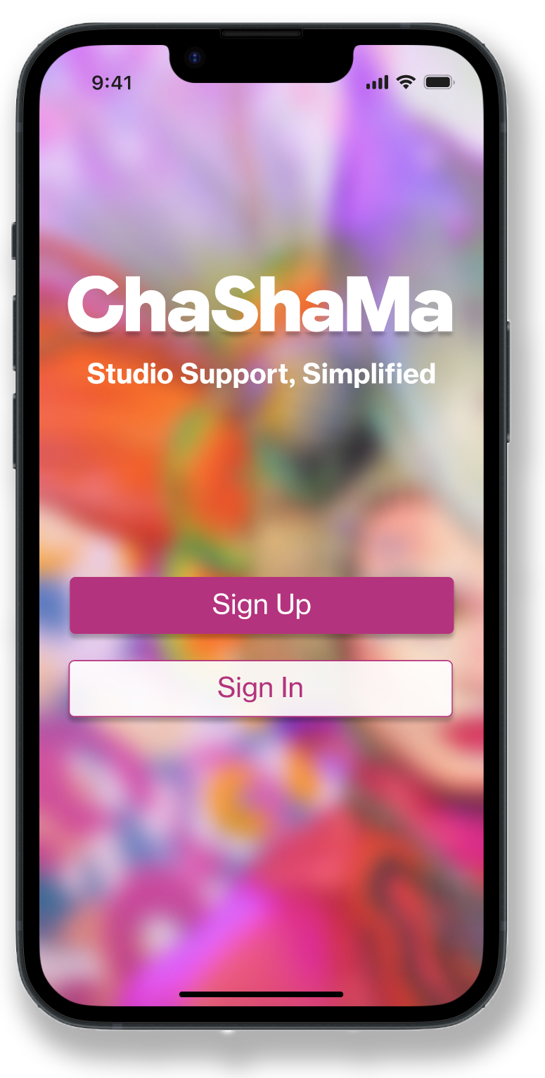
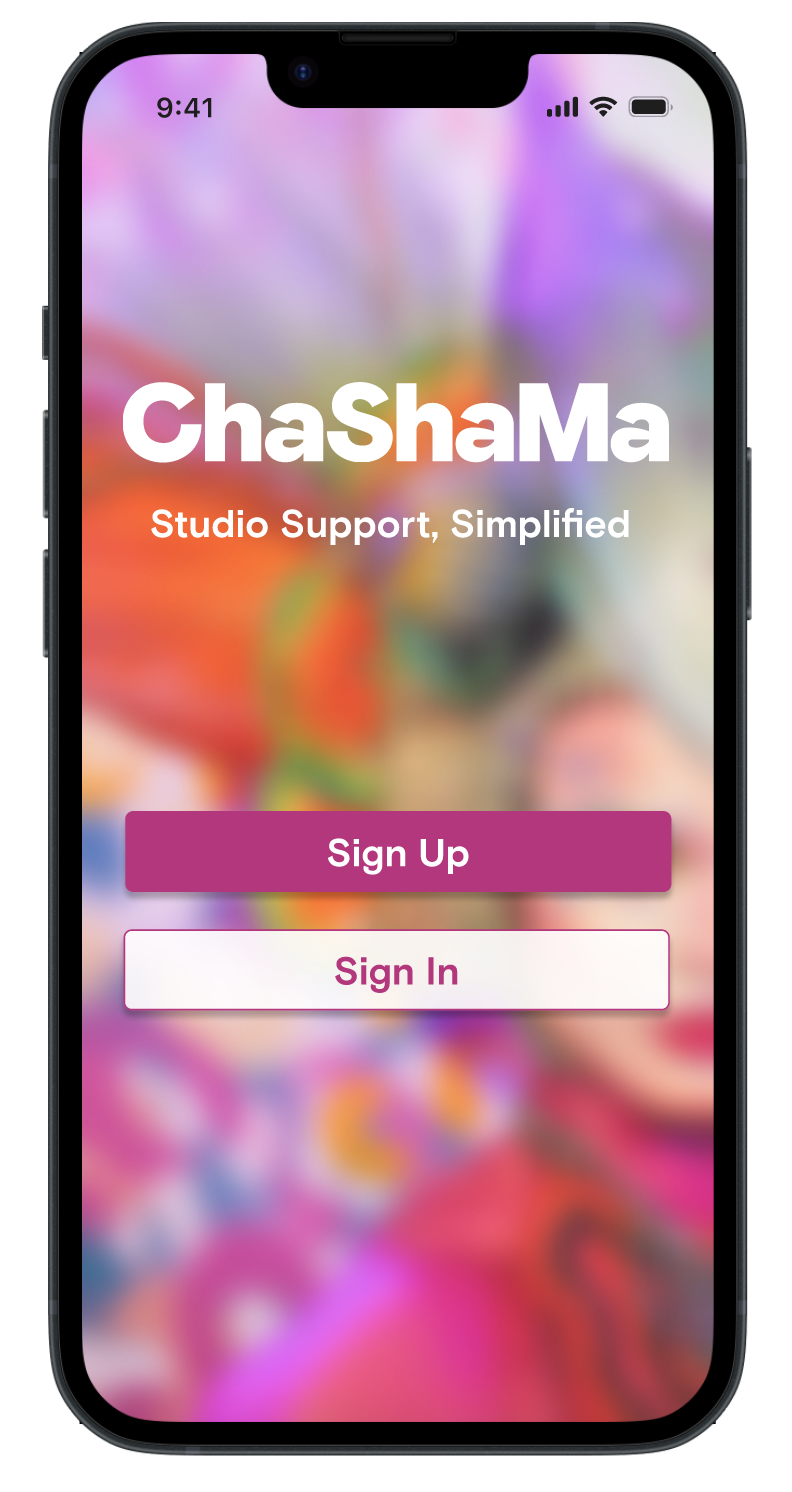
ChaSha-App
My role:
UX/UI designer
My responsibilities:
Self initiated user research, interaction design, prototyping, and usability testing
Project Overview
The ChaSha-App is a proposed AI-powered platform designed to streamline communication between property managers, maintenance teams, and tenants.
Designed for Chashama, an organization that transforms unused New York City real estate into space for artists, the app reduces email overload and enables faster, more transparent issue resolution.
Problem
Property managers, maintenance staff, and tenants were managing high volumes of time-sensitive communication through long email threads, making it difficult to track issues, assign responsibility, or understand status at a glance.
Important details could easily be lost, duplicated, or misinterpreted, increasing friction and delays.
Opportunity
How might we...
Transform facilities reporting into a supportive and human-centered experience for artists, shifting reactive workflows to a more transparent system?
With AI-assisted automation the app could build trust, and empower teams to respond more efficiently and consistently.
Key Challenges
The artists in Chashama’s studios are diverse in many ways, especially age and ability. The app needed to take this into account in order to be accessible for all users.
As a nonprofit, Chashama’s budget is limited. The app needed to perform its primary functions well and in the simplest way possible to optimize bang for buck.
Solution
A mobile platform powered by AI that allows users to submit work orders, ask facilities questions, and receive immediate help in emergency situations.
The app incorporates an easily accessible key code for artists to unlock their studio space, embedding a daily use-case to build familiarity and salience for the platform.
Research
Summary
9 total interviews
7 with current Chashama artists
2 with Chashama administrative staff
Artists are very appreciative of the resources and opportunities Chashama provides, but certain areas for improvement were recurring themes.
Pain Points
No clear reporting protocol for maintenance issues.
Lack of visibility into issue resolution progress.
Lack of clear contact addresses for Chashama staff
Scattered communications and long email threads
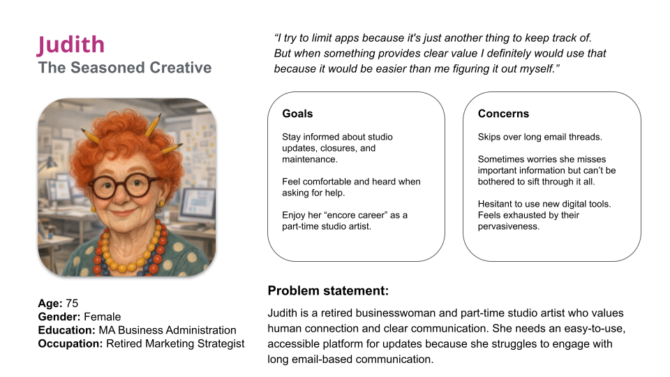
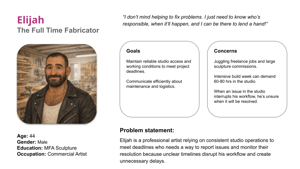
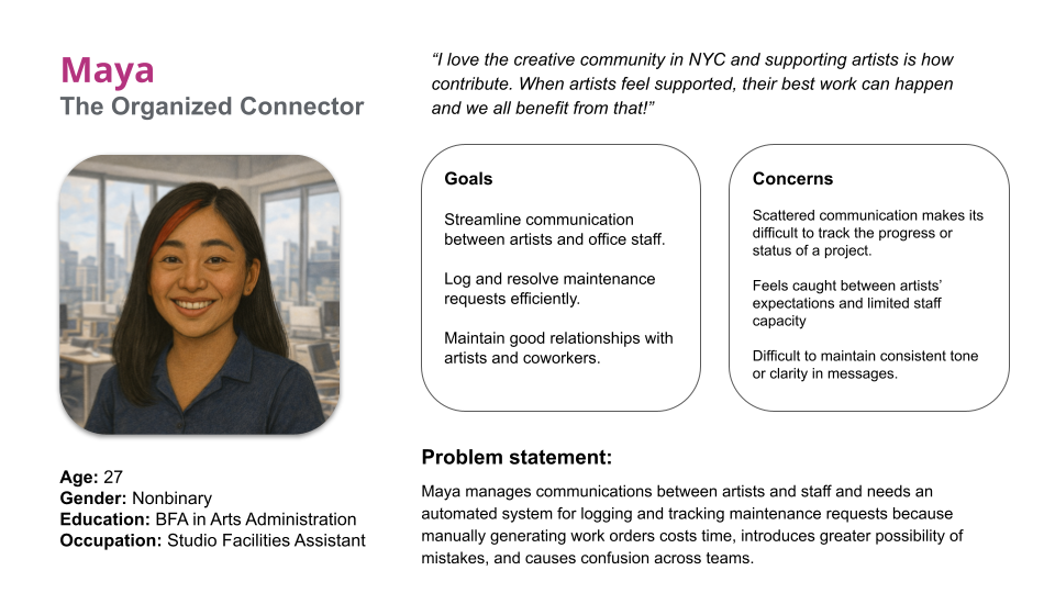
Personas
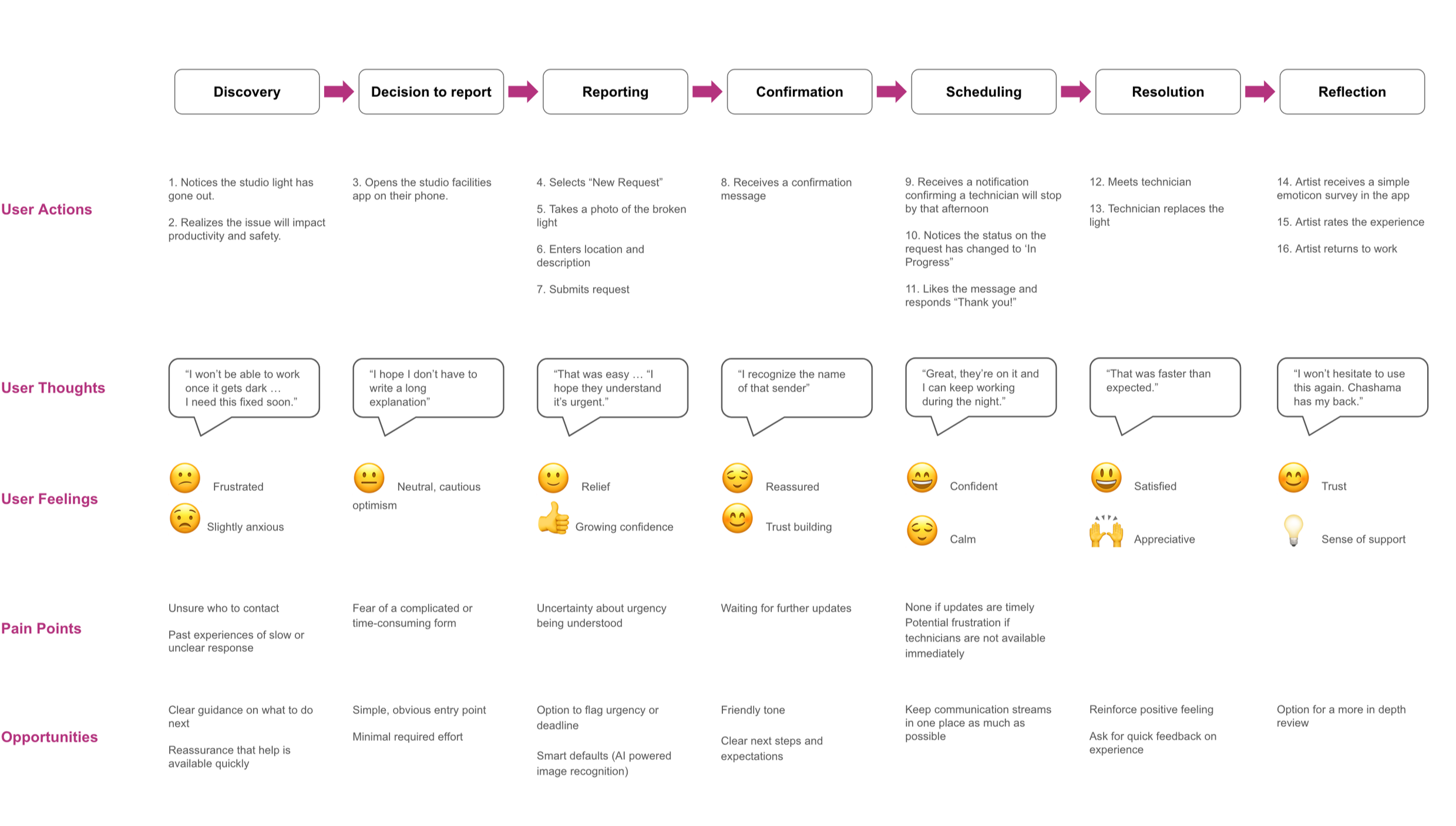
User Journey Map
I created a user journey map to support concept development and identify where and how user pain points can be resolved or minimized. The journey represents the intended experience after implementation of the facilities reporting app.
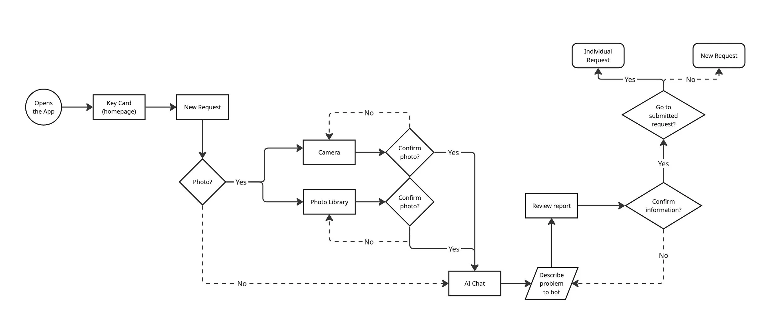
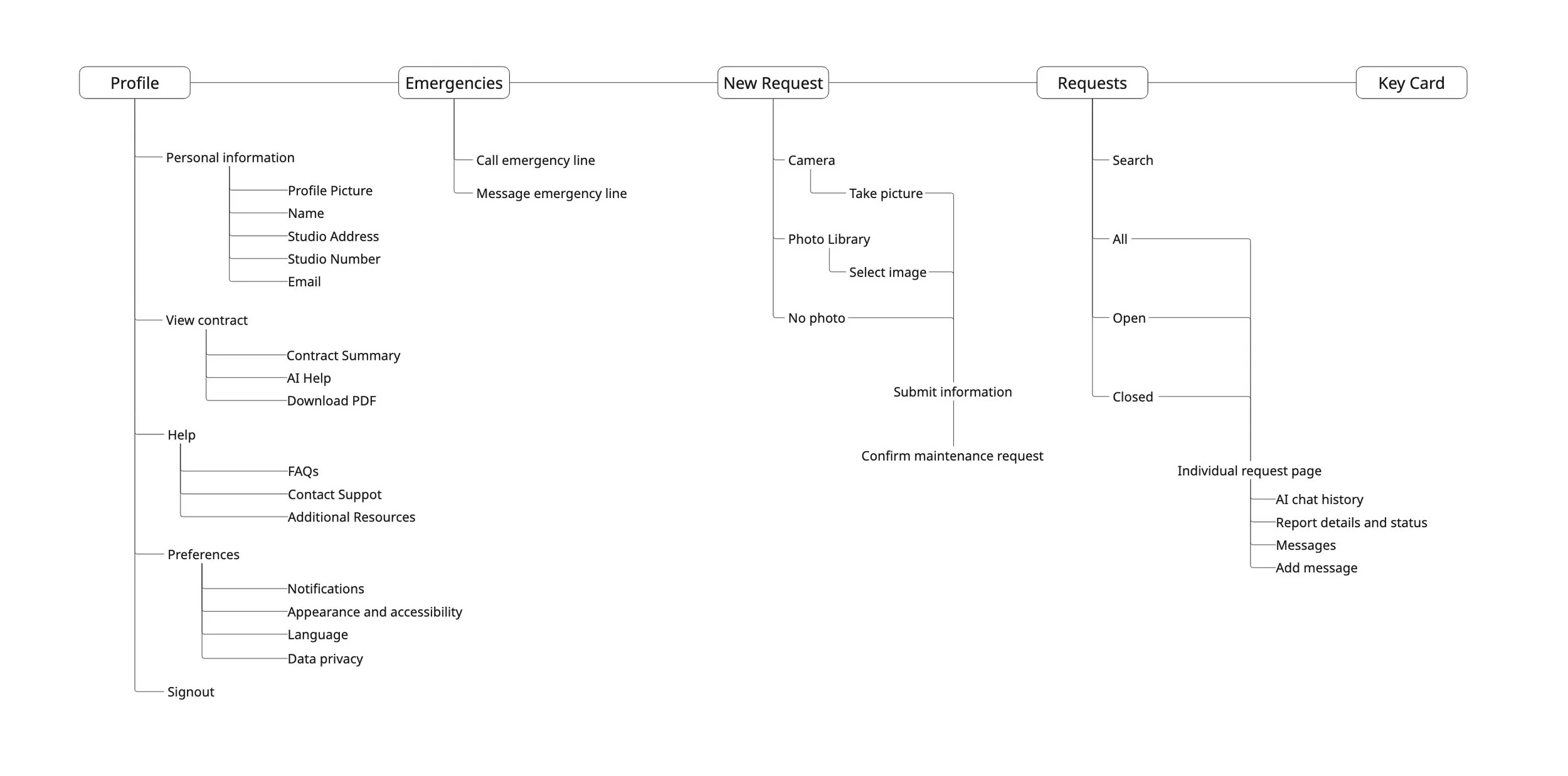
User Flow
This diagram represents the user flow to submit a new request.
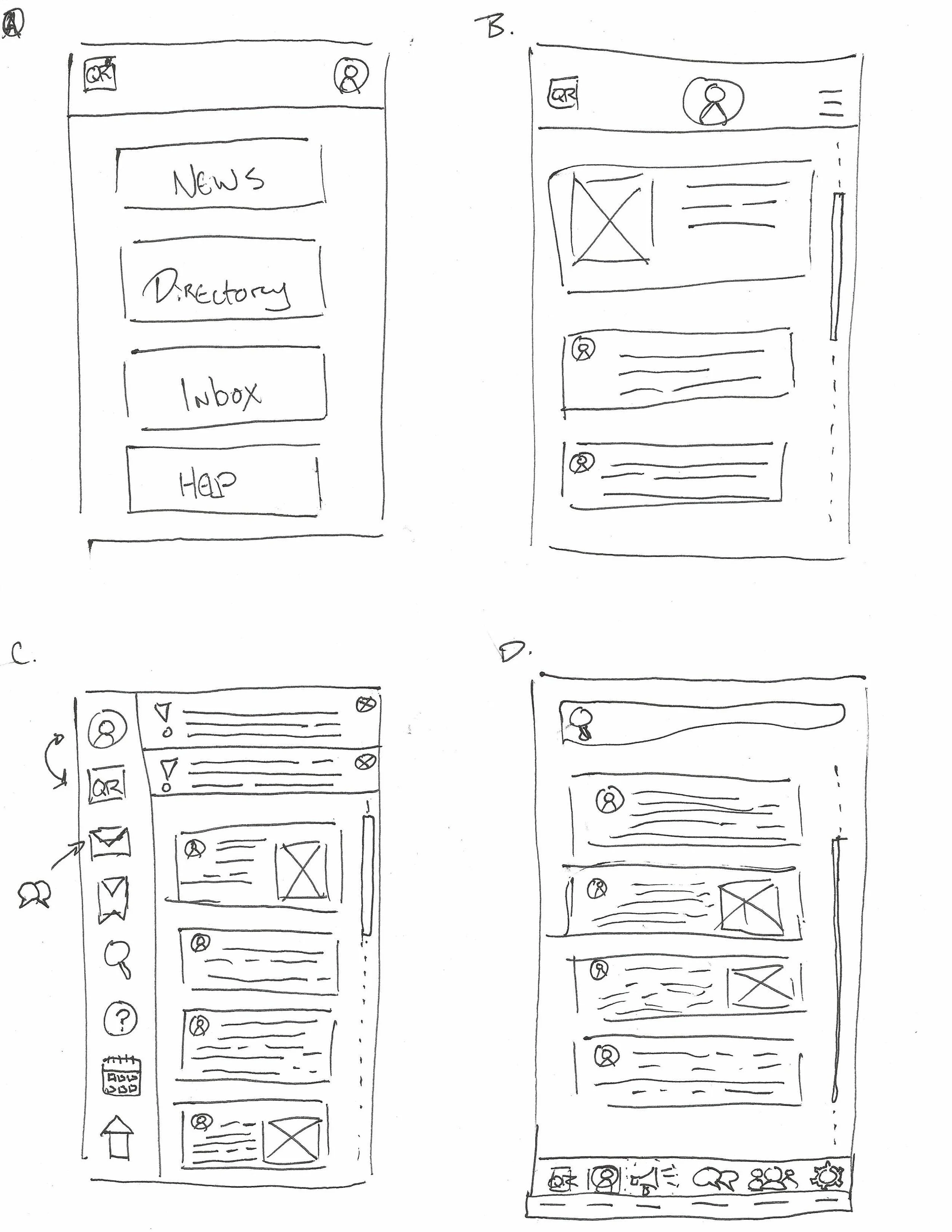
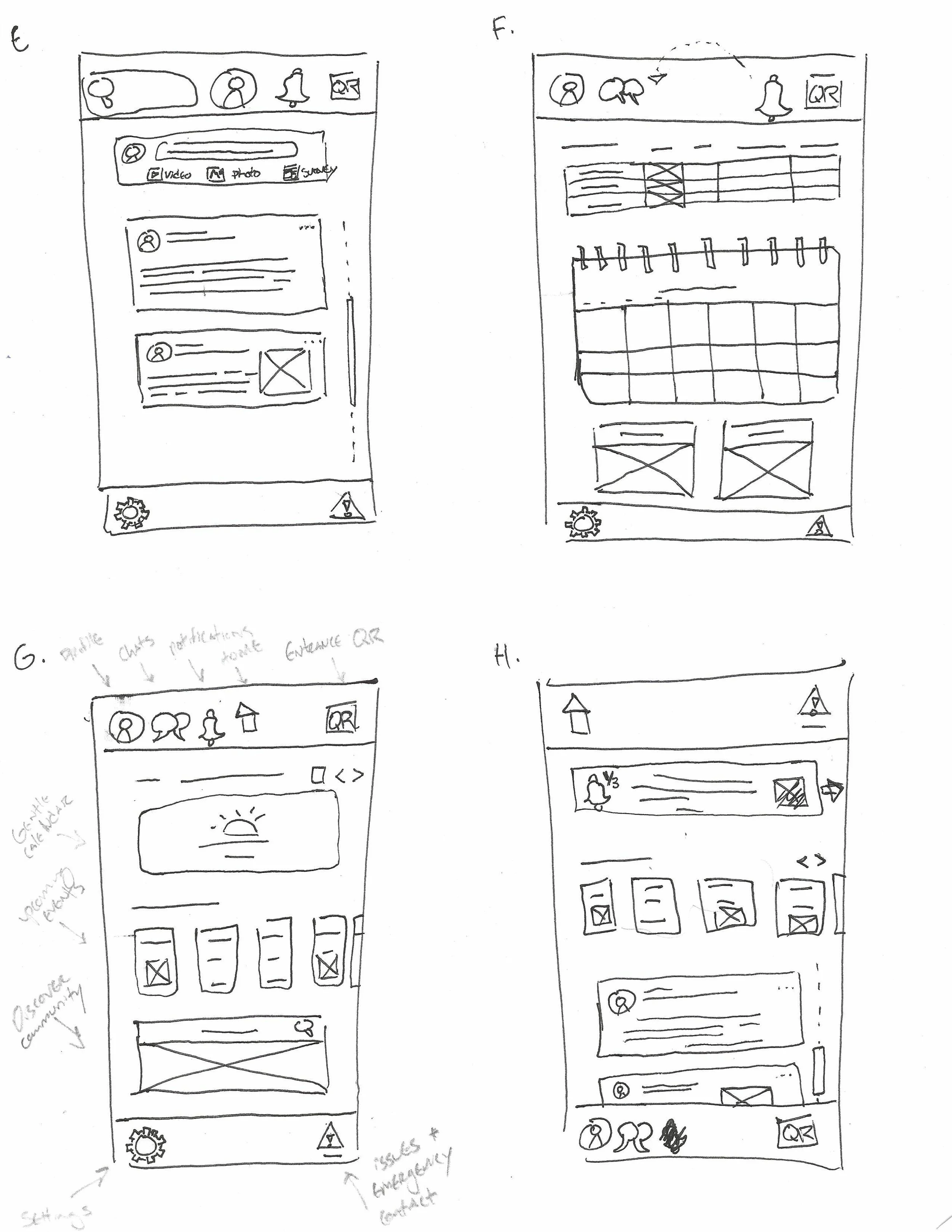
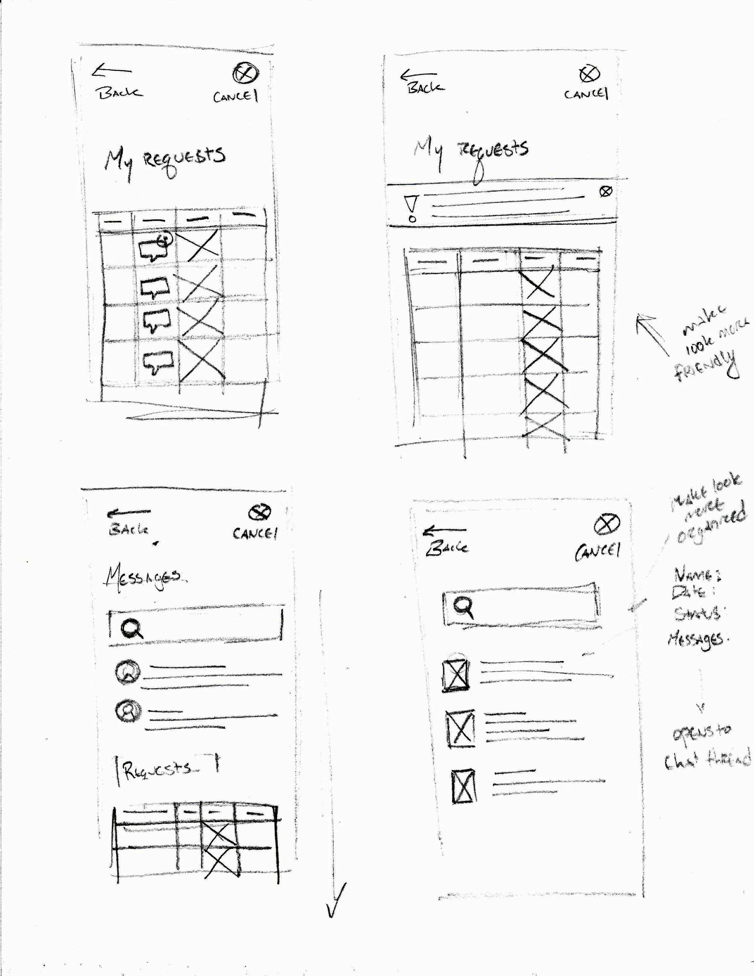
Sketches
A collection of paper sketches created during the brainstorming process.
Concept Testing
The first round usability study tested a low fidelity prototype including functions for artists to view and plan community events. I moderated usability tests with 5 participants aged 26-65.
A key theme arose that the social features actually detracted from the unique value of the app. Here’s a breakdown of how we discovered this and what decisions it led to.
Insight 1
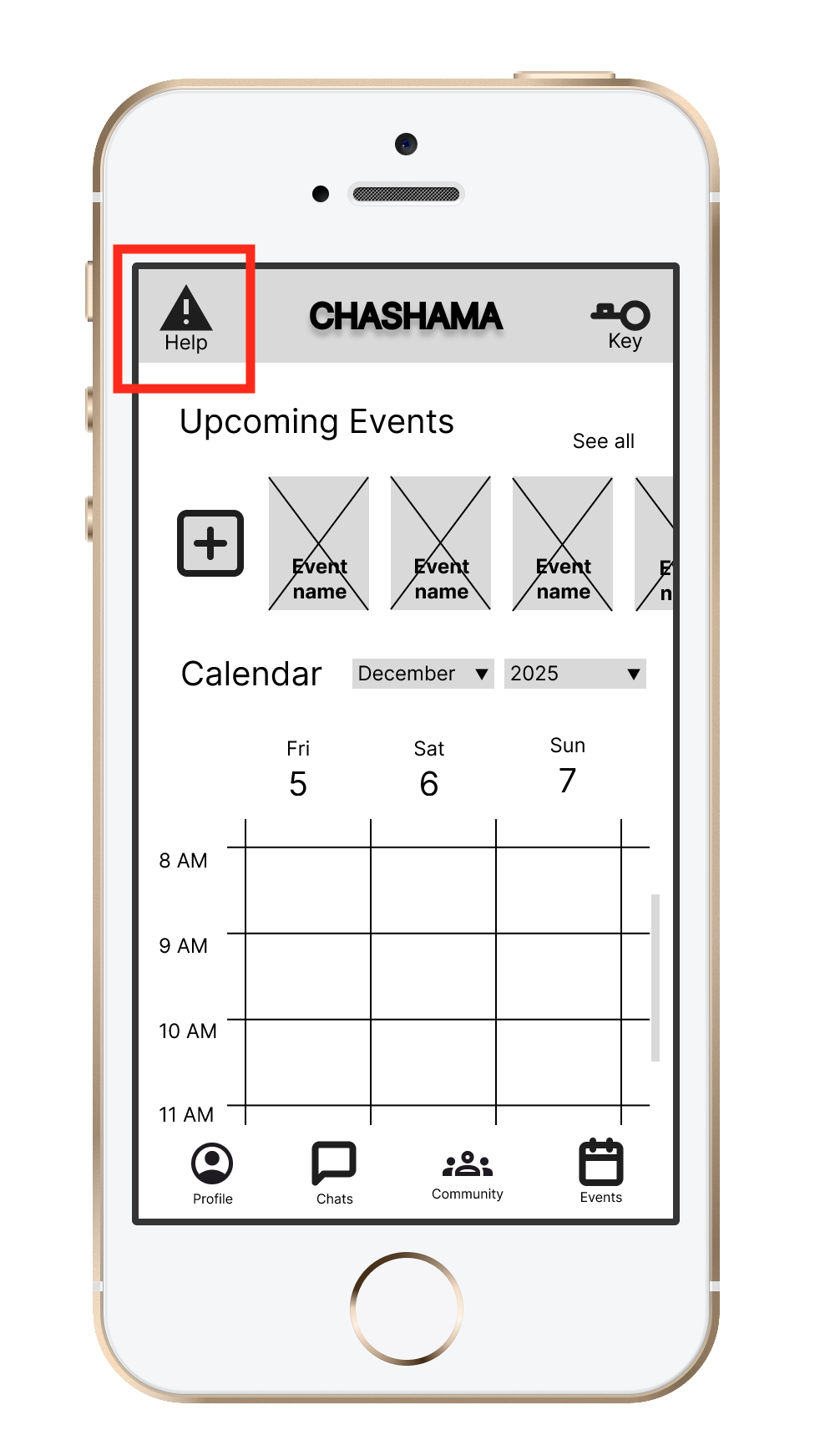
Difficulty knowing where to report facility issues
Move the maintenance button to the bottom navigation bar and disambiguate caption from technical support
Recommendation
Insight 2
Users distracted by social features when seeking facilities help

Remove the inter-artist social features from the design to focus on maintenance and administrative requests
Recommendation
Insight 3
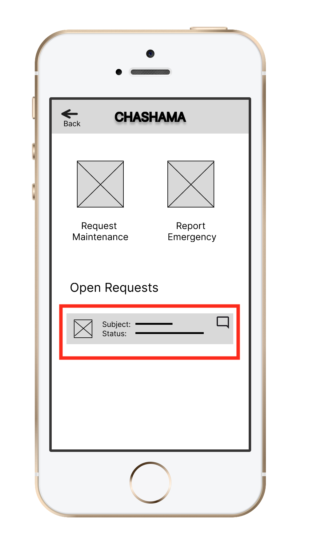
Users responded positively to the work order card but had difficulty finding the full maintenance report
Highlight summarized status details and maintenance report front and center on the Requests page
Recommendation
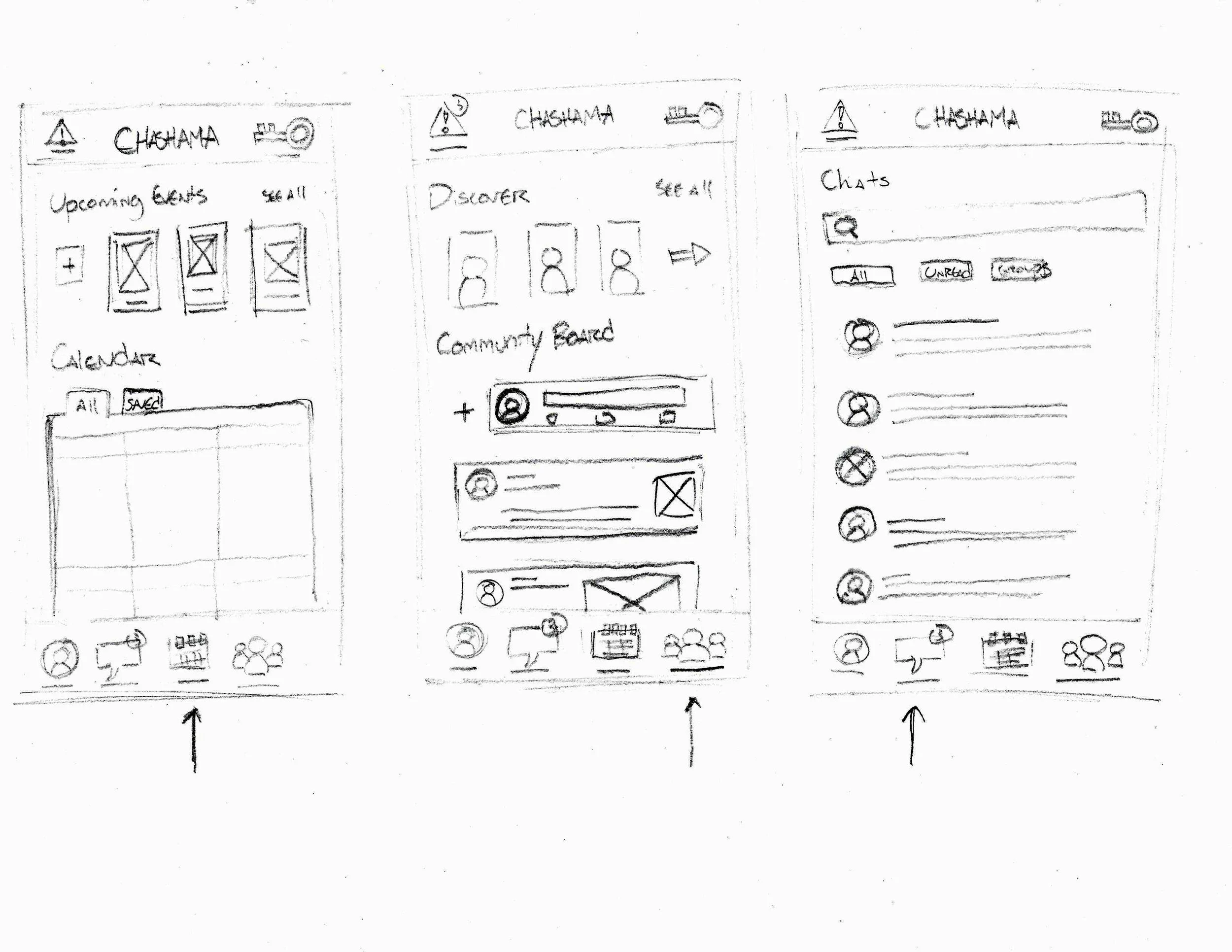
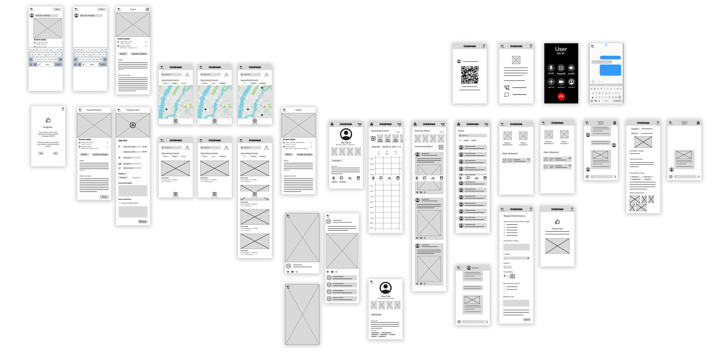
Low Fidelity Prototype
A low fidelity prototype app was created to address concerns from the first usability study.
System Architecture
To present the most concise studio management platform with essential features in the foreground, the whole app experience is divided into 5 major segments easily accessible from every page through the navigation bar: Keycard, Requests, New Request, Emergencies, and Profile.
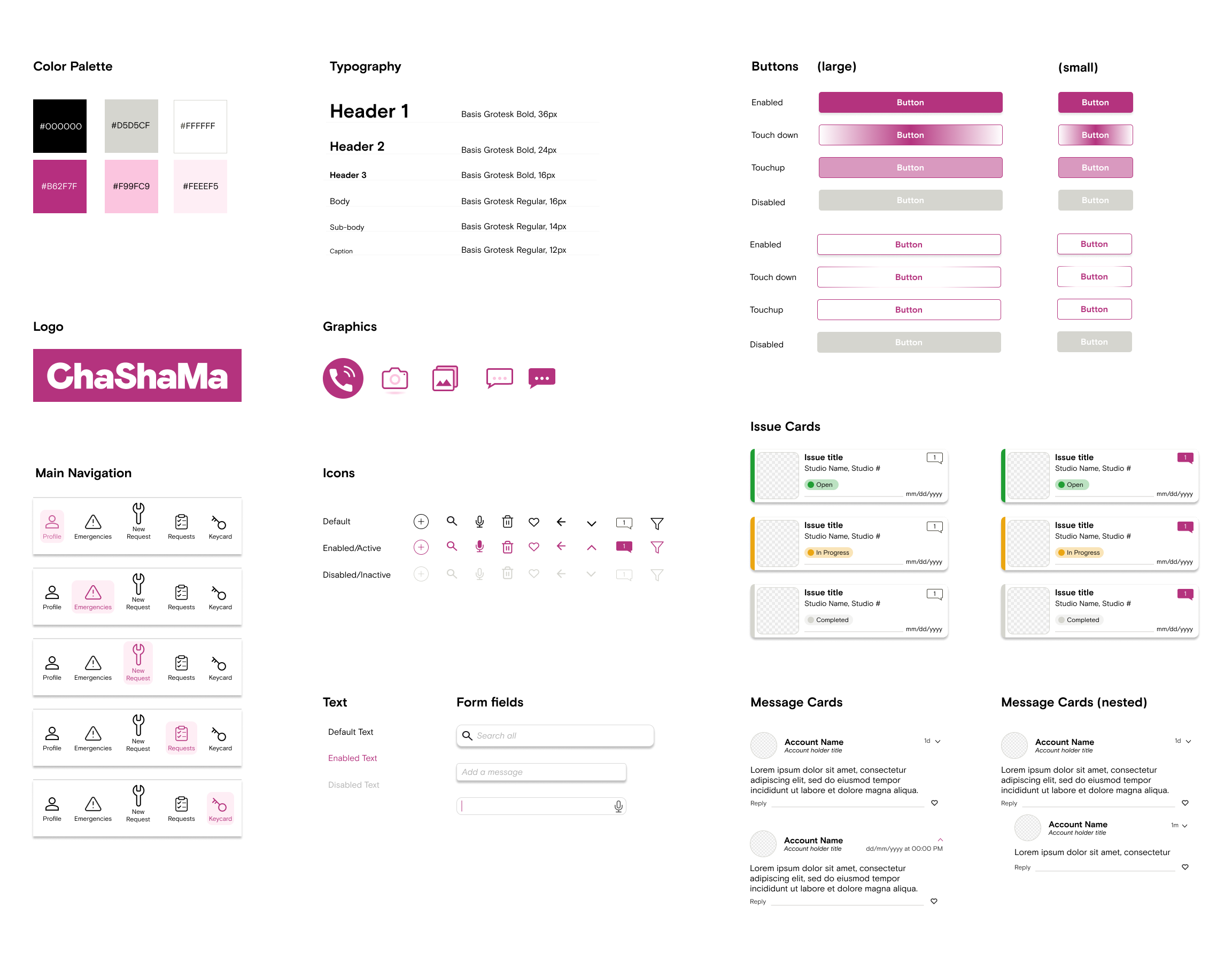
Following the mid-fidelity prototype, a style guide was created to define the app’s UI system. Presented as a sticker sheet, it includes reusable components, customized icons, and guidelines for common interface elements such as buttons, forms, and notifications.
The primary color and typeface were chosen to align with ChaShaMa’s existing branding while conveying empathy and support for creativity without sacrificing readability.
Style Guide
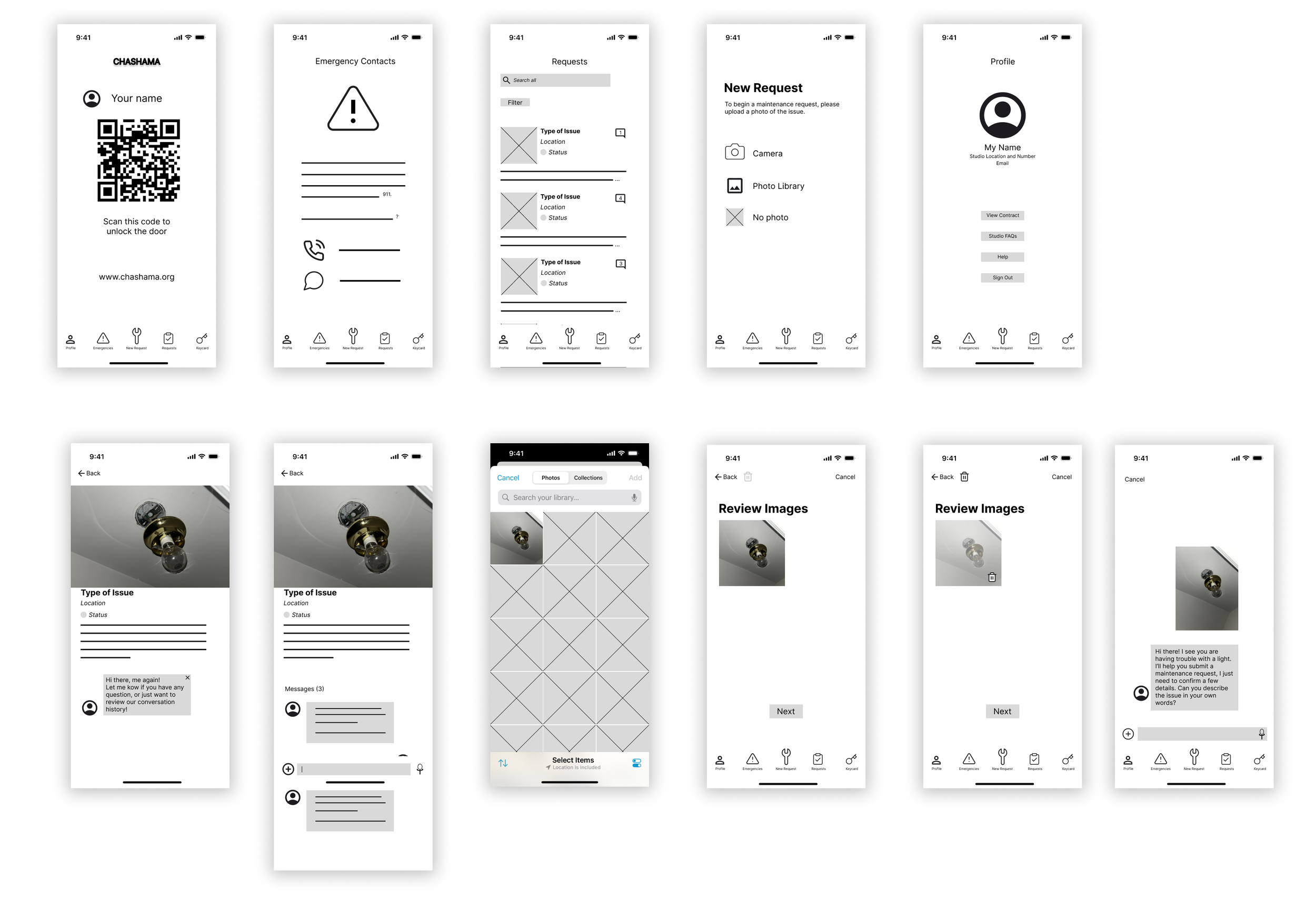
High Fidelity Prototype
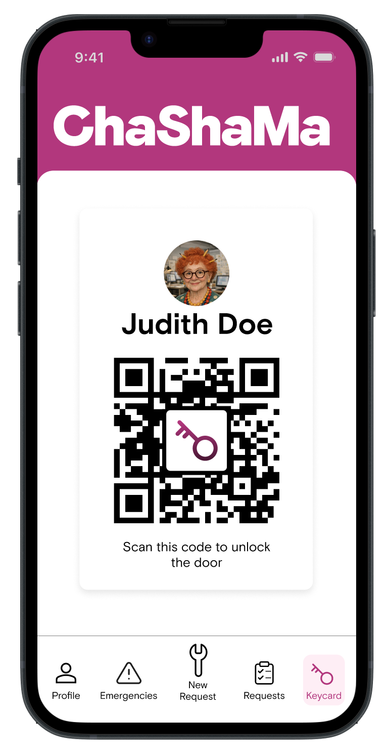
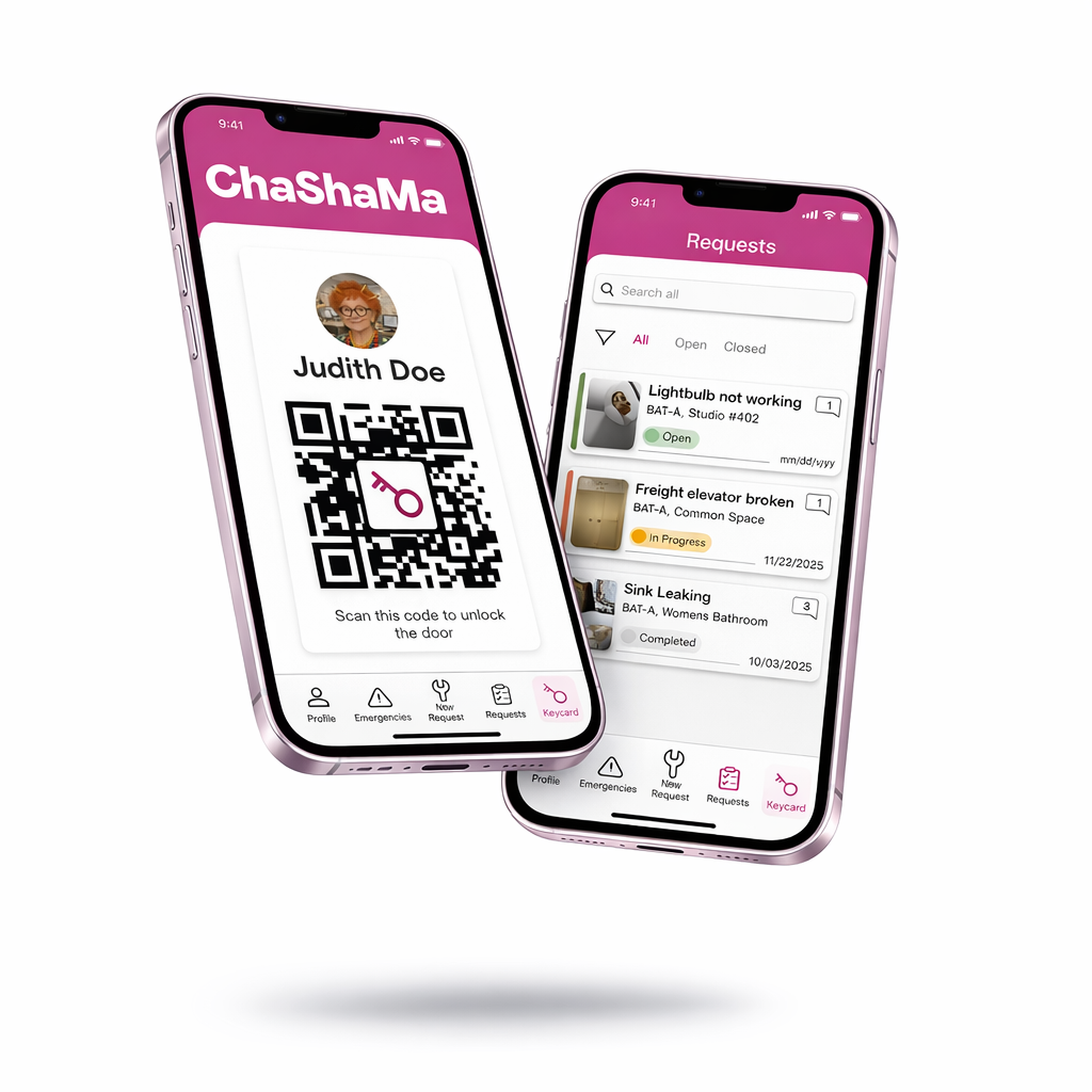
Easy access to studio
After signing up, the app always opens to the Keycard page, allowing users to easily unlock their studio door while building trust and reliance on the app.

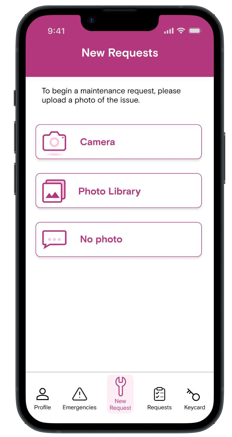
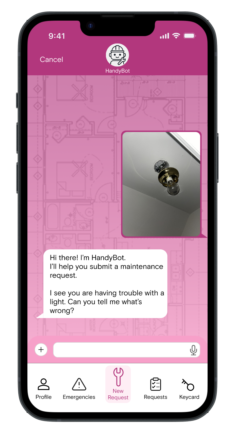
Immediate response
Users can quickly initiate a facilities request by snapping a photo in-app, uploading one from their library, or simply describing the issue.
An integrated LLM is trained to collate user data and submit an organized workorder for the facilities team.
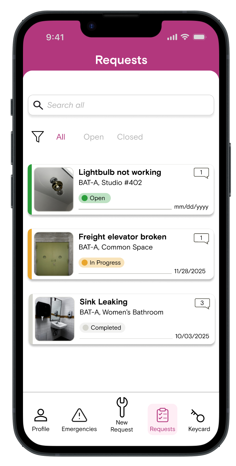
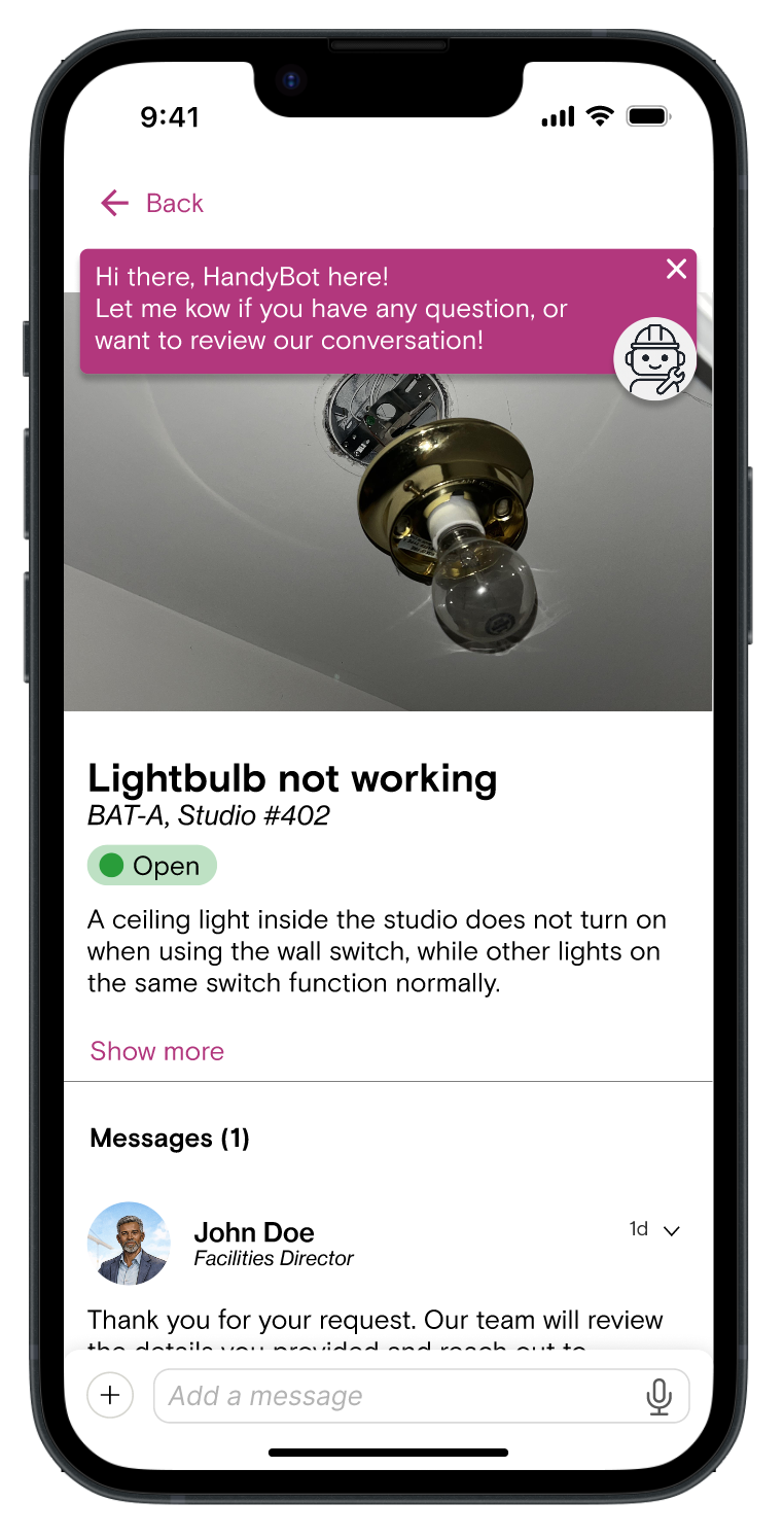
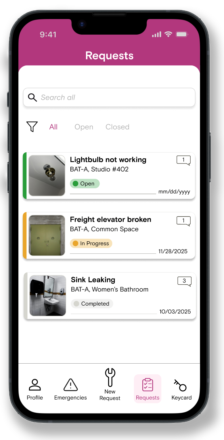
Requests dashboard
The requests dashboard allows users to track submitted workorders, offering a snapshot of each project’s timeline.
Users are empowered to message the facilities team directly on each request’s log, or chat more with HandyBot to review details or summaries.
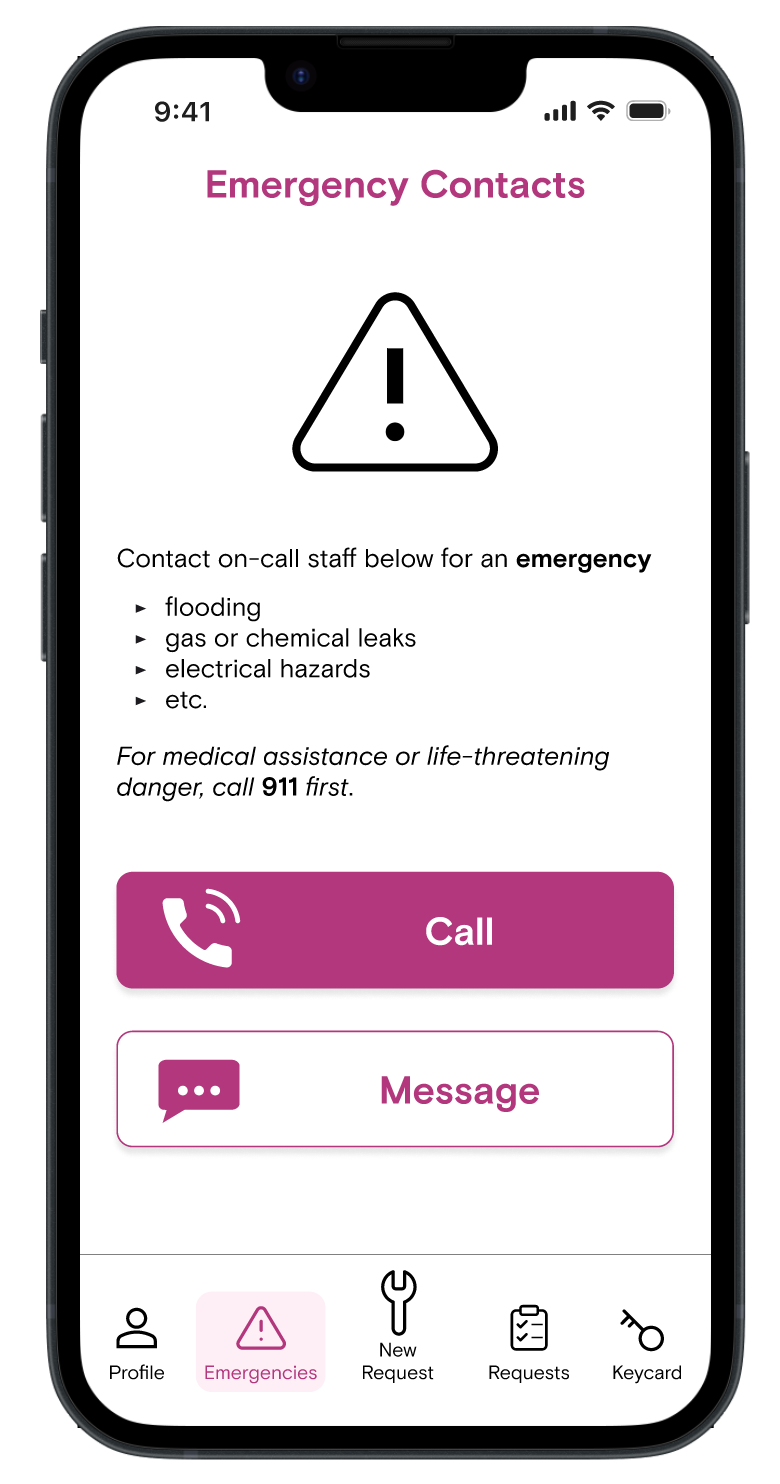
Emergency hotline
Readily accessible on-call contacts allow users peace of mind they will know what to do in an emergency.
The call button auto-dials designated Chashama staff while the message option sends both a text and email.
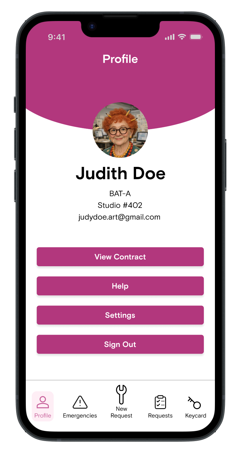
Additional resources
Users have in-app access to their studio contract and handbook for easy review.
The profile page also allows users to customize their personal information, language and accessibility settings, and alerts.
User Feedback
The high fidelity prototype was used for a second round of user testing with 6 participants.
Future versions will continue to iterate and test on improving the design based on these insights.
Text fatigue
Users wanted to skim messages from HandyBot and get the request submitted quicker.
Interface clarity
Users had a positive response to the layout, especially the icons and request cards.
Confidence in AI
Users appreciated the immediate response available through AI, but were ambivalent about troubleshooting with a bot and questioned it’s ability to respond appropriately in edge cases.
Negative email bias
Most users do not associate an email with an immediate response. All users clicked “call” first, and most expressed more confidence sending a text than an email in an emergency.
Example Iteration Based on Usability Test
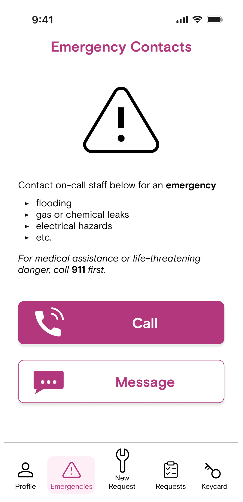
After usability test
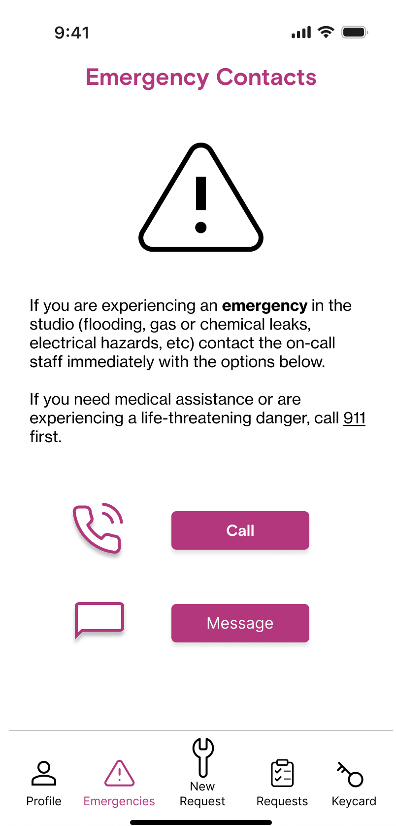
Before usability test
Problem
All users tested chose to call in an emergency yet some were unsure whether that was Chashama’s preference. Additionally, many noted the text was too long to actually read in a real emergency.
Solution
Change the “Message” button to white format to visually indicate calling is the preferred action.
Edit unnecessary text and reformat emergency examples in bullet list for easy skimming.
Impact
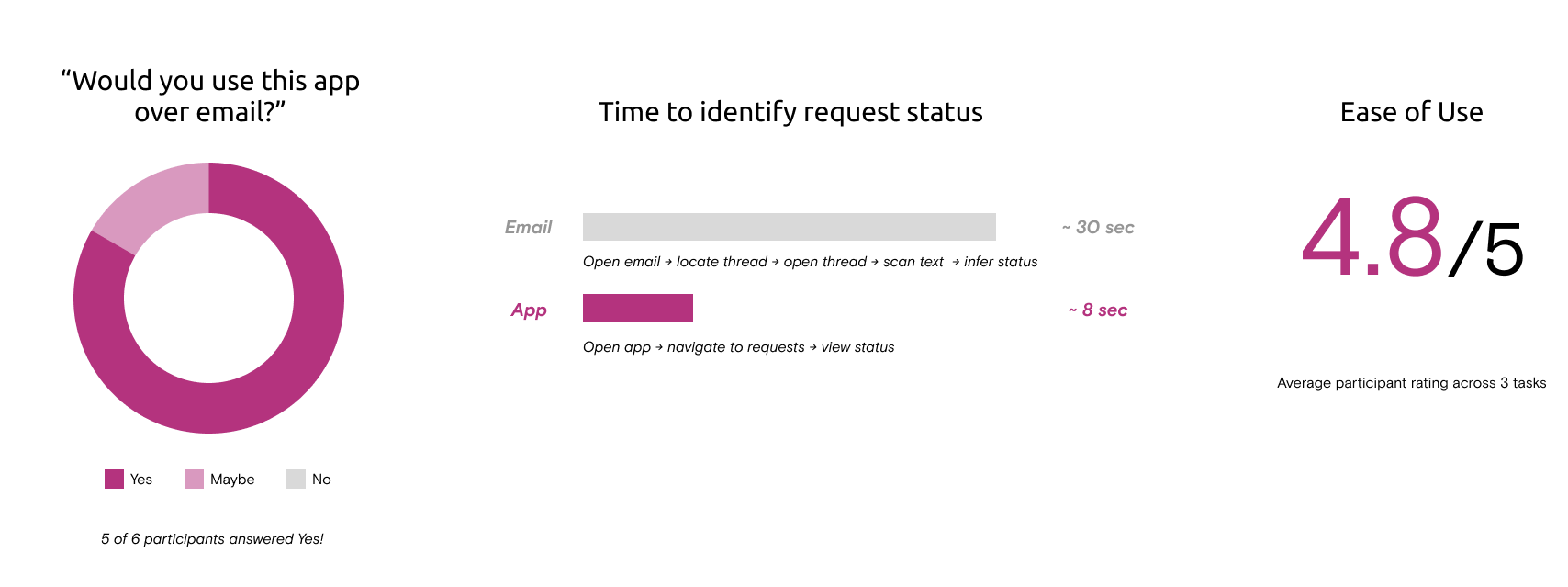
“100% definitely I would do it [. . .]
I think this would be better knowing that sometimes emails don't get answered.”
- A participant from usability testing
Next Steps
Since this is Chashama’s MVP, there are important opportunities for future iterations of the app. Based on our research, these are the features users would like to see:
Pop-up after emergency phone call advising user on what further steps they could take case-by-case
AI search and analysis of studio contract and handbook
Notifications tab for facilities messages relevant to all artists
Artist directory and map of studio spaces
